Doctor Who: Tardis Interior Recreation
A downloadable game
Tardis Console Interior
(Series 11)
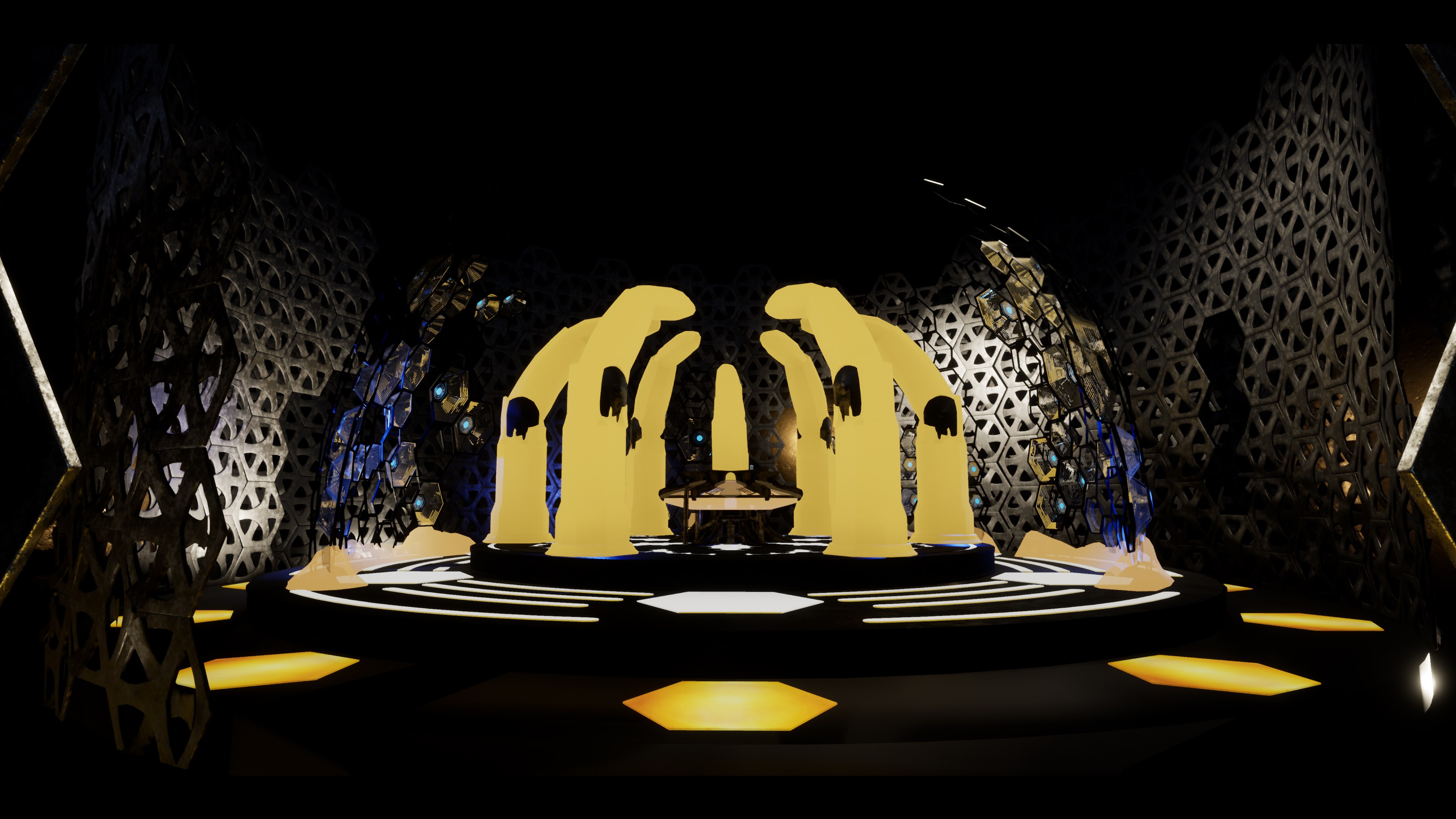
I decided to model the Doctor Who Series 11 Tardis Console Room, with its new design. This being a recreation project I aimed to model the console room accurately to the set used in the TV Show. I think reference is key to any project, I don’t think you can ever do too much, especially not for this project. Partially the reason why I picked to do this version of the console room was because there was a lot of reference material out there. This console design unlike has had a lot of publicity, images and extra videos outside the program Doctor Who itself, which have been fundamental to this project.
I am a big fan of Doctor Who and have previously worked on various Doctor Who recreation projects from the classic era of the show. I decided to work on the latest model of the Tardis as it is so new and fresh in people’s minds.
The whole environment is modular as this environment has many repetitional elements like the hexagonal roundel design, that can be seen throughout. I worked closely with many reference images from the show, trying to map out an accurate interior. One thing I found was that from episode to episode some parts like hexagonal blue lights varied in location from shot to shot as they can be moved on a rail, also many parts of the console vary as the show went on, adding more components and improving it as time went on. So that sometimes made it difficult, but after analysing it closely you begin to admire how much work went into creating a set like thins in real life.
For this project most of my time was spent modelling in Maya (see stages in PDF doc.), building the props and using reference to make sure the scale was accurate. I reused a Tardis model I made from a previous project and adjusted it, although the plan was to accurately overhaul that police box to match the current one from series 11. I spent some time in Zbrush on some of the components, but the original plan was to really go into detail on the central crystal (Time Rotor) and surrounding crystal pillars in Zbrush. So that I could bake all the high poly Zbrush sculpt data onto the low poly model, but I sadly did not have time to do that for the submission. I textured the models in Substance Designer, although like the Zbrush work, I didn’t have enough time to do the crystal components justice. I plan to continue this project over the summer improving on these aspects.
I spent little under 3 weeks on this project and I am happy with my outcome so far, I worked a lot on the models, but then didn’t have enough time to texture and light the scene in Unreal, to the quality I wanted. I planned out the location of all the console’s controls and switches, but decided to allocate that time to texturing and lighting the scene, instead of modelling them. I plan to finish this project modelling all the rest of the components and their quirks, making the switches/levers animated and interactive in game. Also, I plan to improve my texture work and material blueprints to make the materials on the crystals animated, making the lights pulse and the environment more believable.
I enjoyed working on this project, and I definitely learnt a lot of things about the set that I wasn’t aware of previously as a viewer. I tried to capture the ambiance of the scene with lighting to try and mimic it’s on screen appearance. The screenshots of my environment have an aspect Ratio of 2:1 with black bars to try and mimic the new feel and presentation of the show.
| Status | Released |
| Rating | Rated 5.0 out of 5 stars (1 total ratings) |
| Author | TheGreatGeneral |


Comments
Log in with itch.io to leave a comment.
where is the download link?
Looks good! Keep up the good work :) I am also a huge fan of Doctor Who and even sing the theme song